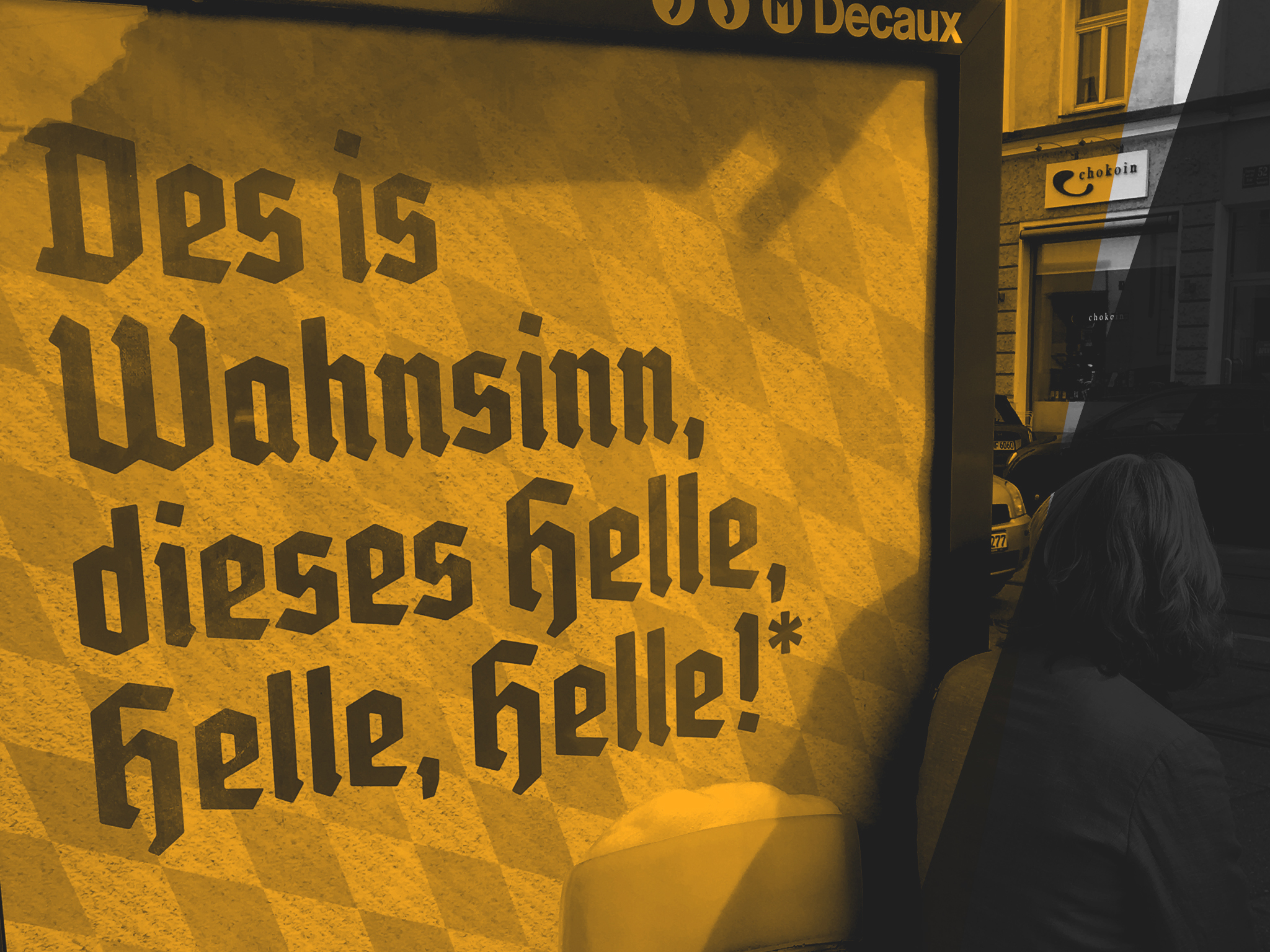
Your Cart:
Checkout

Licensee’s Address
 This data must apply to the end user (licensee) and will be used on your invoice


 Learn more about how we protect your data in our GDPR

 If you have further questions to our payment methods head over to our support section or simply e-mail us

  • “Nix für Preißn”
    Display font for a brewery’s advertising campaign. Customer: David & Martin / Hacker Pschorr
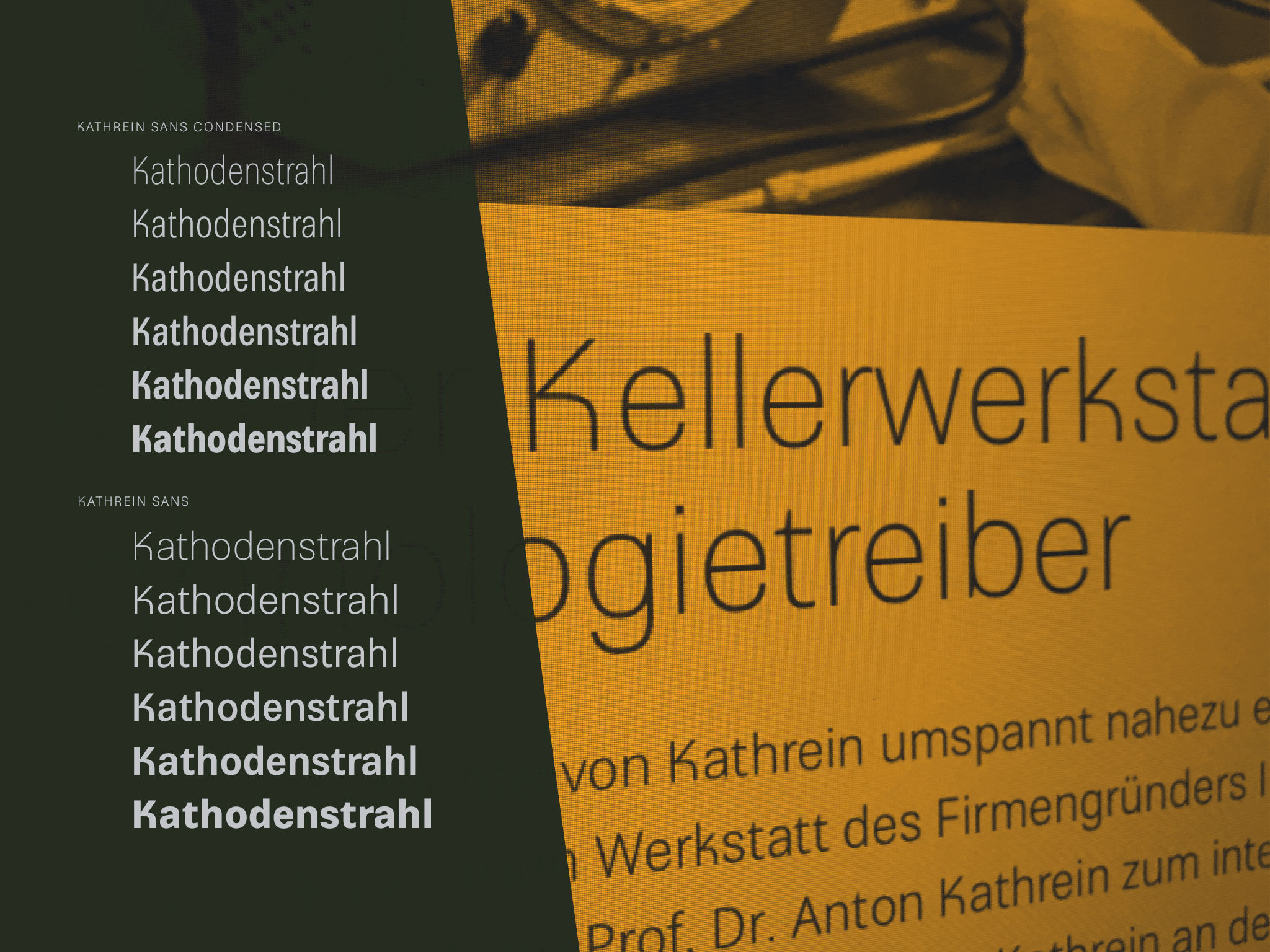
  • “Kathrein Sans”
    Corporate font for an international corporation working in the field of network and broadcasting solutions. Customer: Kathrein Werke AG
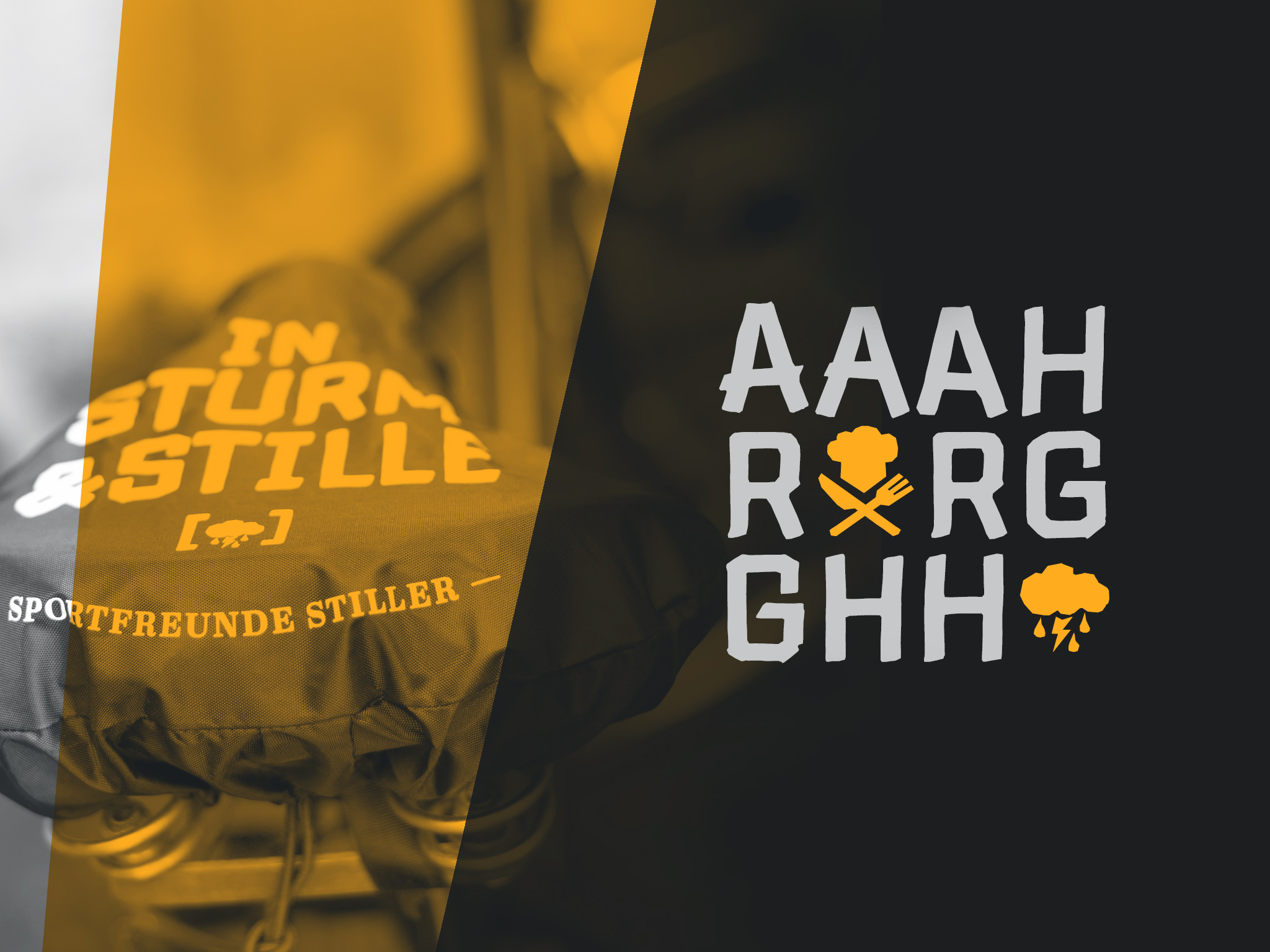
  • “LD Sport”
    Typeface for the album »Sturm & Stille« by German rock band Sportfreunde Stiller. Customer: Sportfreunde Stiller
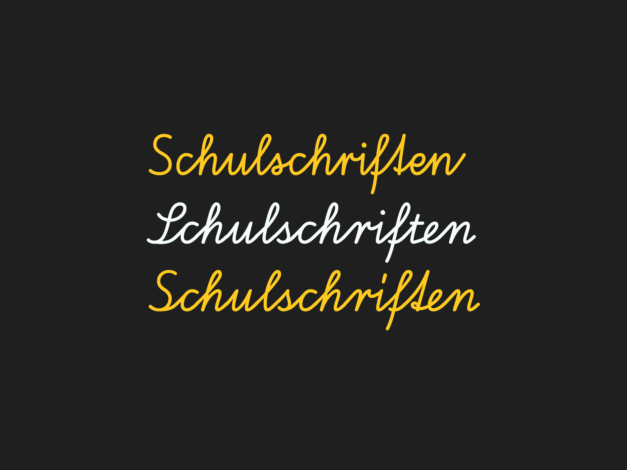
  • “Schulschriften”
    New development of German school script fonts. Different versions for a publisher of learning materials. Customer: Klett Verlag
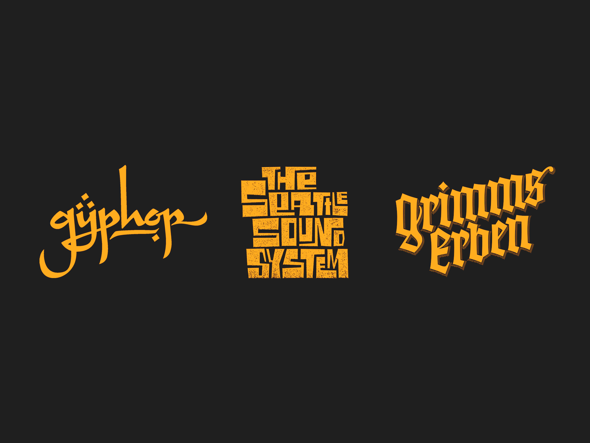
  • Various Logotypes
    Logotypes / lettering for different customers. Customer: JKP / Seattle Sound System / Walde & Graf Verlag
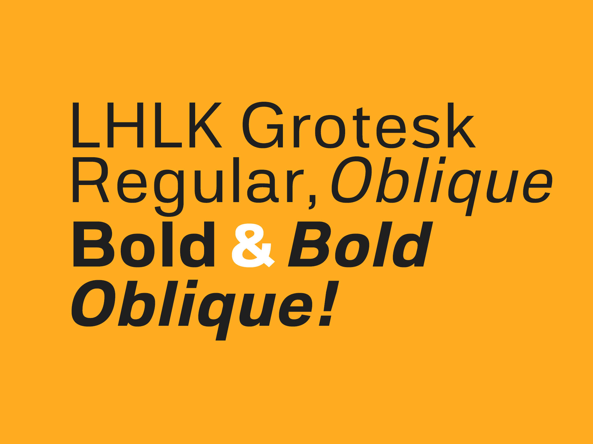
  • “LHLK Grotesk”
    Corporate font for a PR agency. Customer: Loesch Hund Liepold Kommunikation

Your project, your type! People often think of type as a constrained and static design medium. But have you ever thought of it as something more versatile and variable? A tool you can customise to meet your needs? Nowadays, type is no longer cast in metal. Instead, it’s highly flexible and can be adapted to suit a distinctive visual language. Here are just a few inspiring custom ideas you might consider for your next project. Just contact us for your personal inquiry or even if you have some further questions!

→ Aesthetics, personality and conformity: A tailor-made font can be the foundation of a unique yet adaptable design system and a distinctive corporate image. But if you think only global corporations can afford it, then think again, because type design is scalable to suit almost every type and size of business or project. From a limited character set as a display face for an ad campaign to a full-fledged type family for copy in multiple languages – the options are numerous and diverse.

→ Word marks and brands: Sometimes the lack of awareness around the quality of letter shapes and the balance of black and white space is quite painful to observe! If you’ve created your own type, ask a type designer to take a look at it to make sure it’s up to scratch. Custom-made wordmarks and lettering need to be catchy and timeless, so it’s best to call in an expert. A good job can achieve great things. Think of Coca Cola, for example …

→ Adding custom glyphs to an existing typeface can save you a lot of bother, whether it’s logos, pictograms, currency signs or figure sets. Instead of fiddling with small images or font substitutions, just talk to us about adding the glyphs needed to the fonts you use most.

→ Adding language support is becoming more and more important as a way of developing fonts for multilingual use. Your initial choice of typeface may have to be extended to allow more global communications at a later stage. This is fairly simple to do and may entail a few additional glyphs – but it could equally well involve developing a complete set for a different script system.

→ Improving spacing and kerning is far more important than most people think. Like in our example, typefaces in the old days were often spaced and kerned for use with ­lower case only. With a few adjustments, this font can now be used for an all caps setting. You might like to bear this in mind if the typeface you’re using is older than a teenager.

→ Improving screen rendering is not just a nerd’s game. When you license a font, it’s likely to come with computer-generated “hints” only. But for better on-screen legibility, you’ll need ­to ask for manual hinting, which is specifically crafted for each individual letter shape.

→ Adding automated functionality can save a lot of manual work when typesetting. So called “OpenType feature scripts” will be embedded into the font and executed by the user. Depending on the context, scripts like these can perform substitutions or positionings of letters. The example above shows how quotation marks and the spanish exclamation mark have been automatically raised to match the height of the caps, which have also been spaced wider.

→ Custom Font Licensing is not really a piece of cake. Especially when we’re talking about larger projects with multiple fields of usage and yet unknown parameters of scale. This is where custom font licensing may be the better solution. Let’s talk about a corporate license, that doesn’t care about all of these different fields of usage. Or a festival license, that cuts the costs down because it’s only valid for a few months. Or an OEM license, which allows implementing our fonts into your soft- or hardware. These are typical parameters of font licenses. And all of them are negotiable:
  • field of usage (type of license, desktop / web / e-book / app etc.)
  • extent of usage (scale of license, number of computers, number of page views)
  • duration of usage (perpetual or temporary)
  • exclusiveness (only you can use it or any other licensee)

Miscellaneous: Type Specimens & Other Related Material

  • Schrift. Wahl und Mischung.
    Over a longer period, Kai Büschl and Oliver Linke wrote a book about choosing and mixing type wich finally became reality right before christmas 2021.
    Attention: Content completely in German language!
    400 Pages, Size: 21 × 28 cm. Hardcover.
    P.S.: Typeset in LD Moderne Slab and LD Grotesk.

    Order via the publisher Rheinwerk Verlag.
    Printed Edition, € 49,90.
    ISBN 978-3-8362-6171-5
    (Also available as E-Book.)

  • Type Specimen 2020
    Our new — and all complete — typespecimen comes as a newspaper with 16 pages.
    Size: 31.5 × 47 cm.

    This product is free! We only charge a shipping fee of € 4.00! While stocks last!

  • Genzsch Antiqua Redesigned
    Michael Wörgötter wrote a little book about our current project: The redesign of famous Genzsch Antiqua from German typefoundry Genzsch & Heyse. Attention: Content completely in German language! Size: 12.5 × 21 cm.

    This product is free! We only charge a shipping fee of € 4.00! While stocks last!

  • Type Specimen Poster 2017
    Printed Din A2 (23.39 × 33.11 inches) sized specimen of our fonts. Must have for type enthusiasts as well as type-pros. The Poster will be shipped folded to Din A4.

    This product is free! We only charge a shipping fee of € 4.00! While stocks last!

  • Type is no longer cast metal.
    We gathered our thoughts about custom fonts in this little 16 pager. So if you want to know more about this, you’ll love it. Printed in full color. Size 13 × 20 cm.

    This product is free! We only charge a shipping fee of € 4.00! While stocks last!

    or download a PDF here right away.

  • Type Specimen Poster 2014
    Printed Din A2 (23.39 × 33.11 inches) sized example of our fonts. The front is an awesome poster, the back shows detailed samples of all our type families. Attention this is the old – but still nice – version of 2014.

    Send / Save Cart

    If you are not the licensee, you’ll be able to send your prearranged cart via e-mail by clicking the following link! You also could use this to save your cart for a later purchase.

    https://test.lazydogs.de/orders/show-cart/19/NvzI6BEgrQ

     If you have further questions on licensing, please head over to our support section and filter by licensing!

    You’ll get mail!

    An email has been sent to your adress! Please ckeck your inbox, pay and stay tuned!

     If you have further questions on our purchase process, please head over to our support section!